Making: Plant a Tree
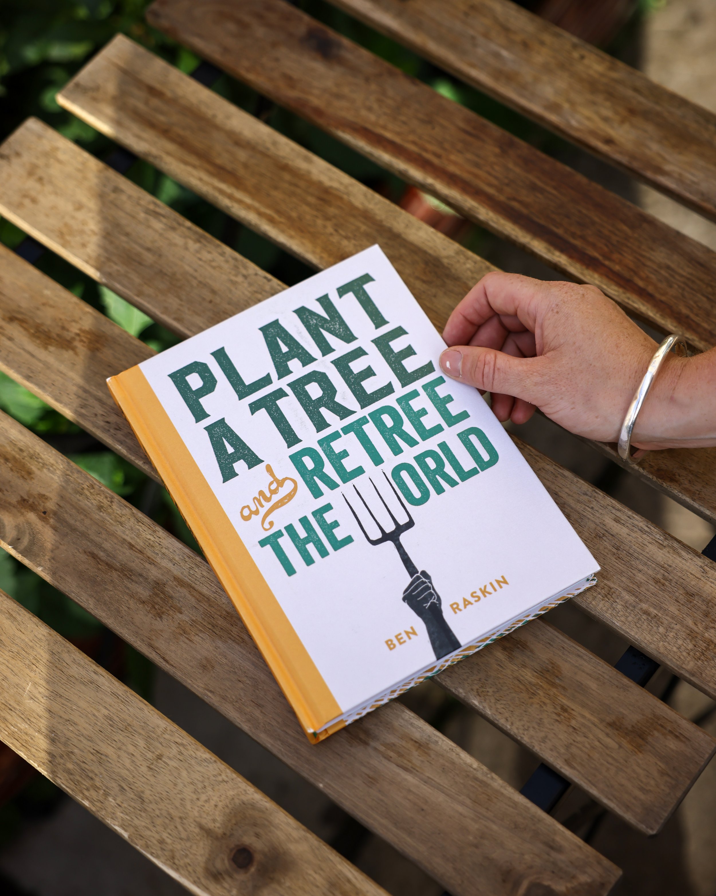
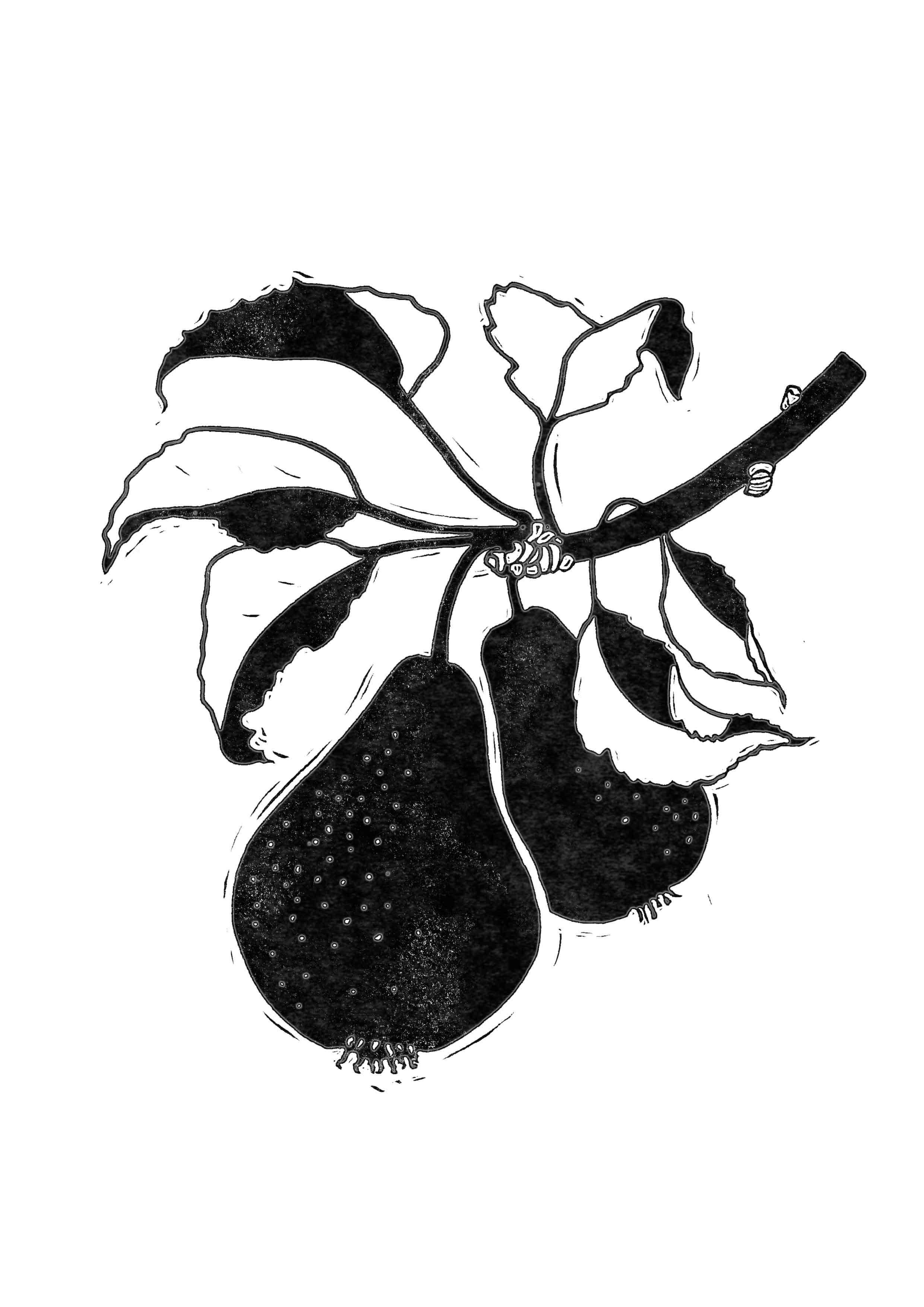
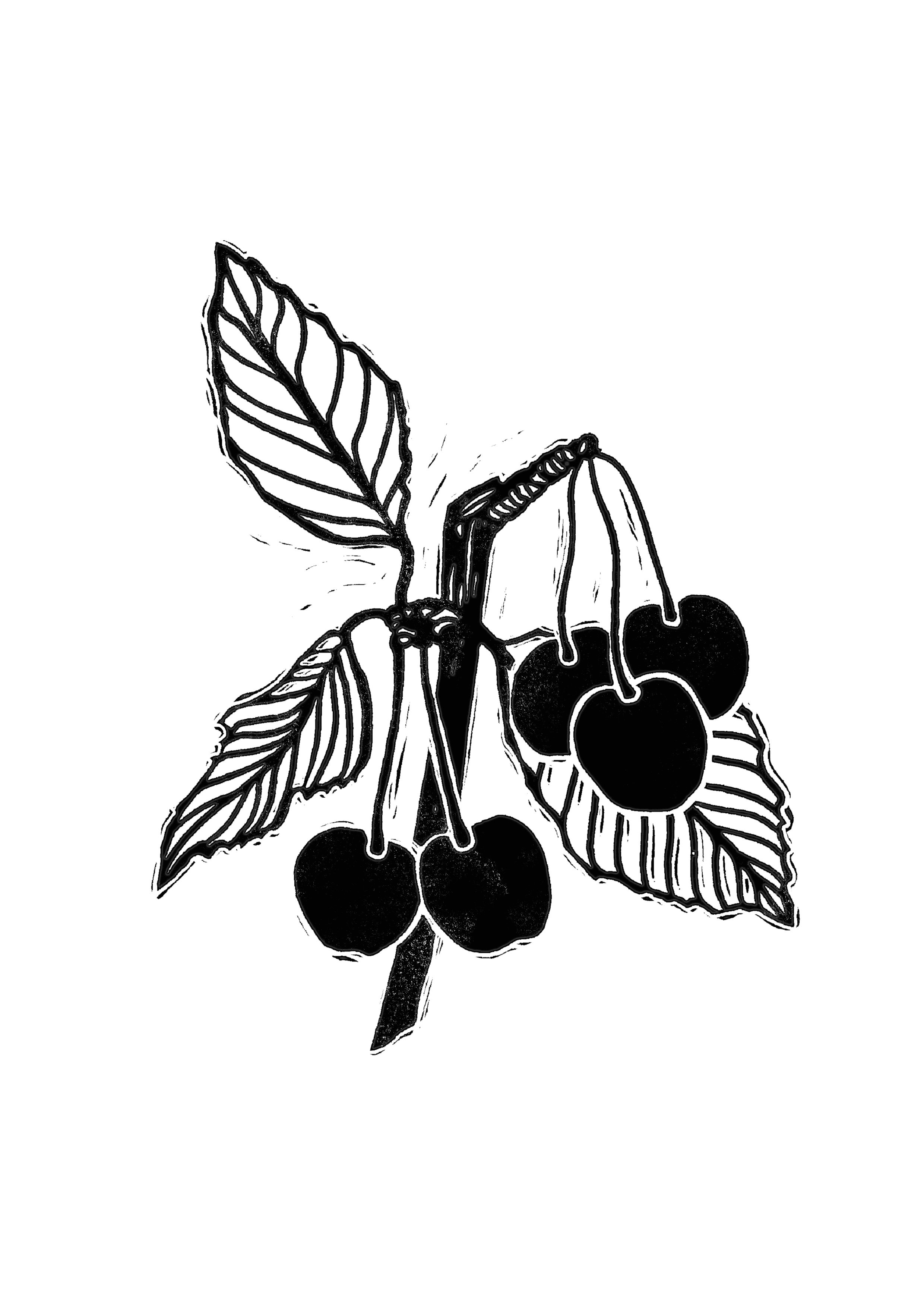
This weekend has been a very wholesome affair. Between walks, pub lunches and a seed-swap, I potted up six lovely new fruit trees in my garden. Two apples, two plums, a cherry and a pear. All of them are suggested species to plant in this excellent book by Ben Raskin, which I worked on last year.
This project is a real favourite of mine, so I wanted to share a little of its story.
I was asked to come up with a design approach by commissioning editor Monica Perdoni, who I have worked with on lots of Leaping Hare titles. She knows my self-driven projects as well as my broader design portfolio, so she knew a book about trees, gardening, well-being and environmentalism would be a great fit for me!
I was asked to pitch some illustrators whose style would work for the book. The artwork needed to be timeless and beautiful, appealing to a wide range of tree-lovers, but also to fit the title’s activist message; a call to arms for a tree-planting revolution.
There was only one woman for the job!
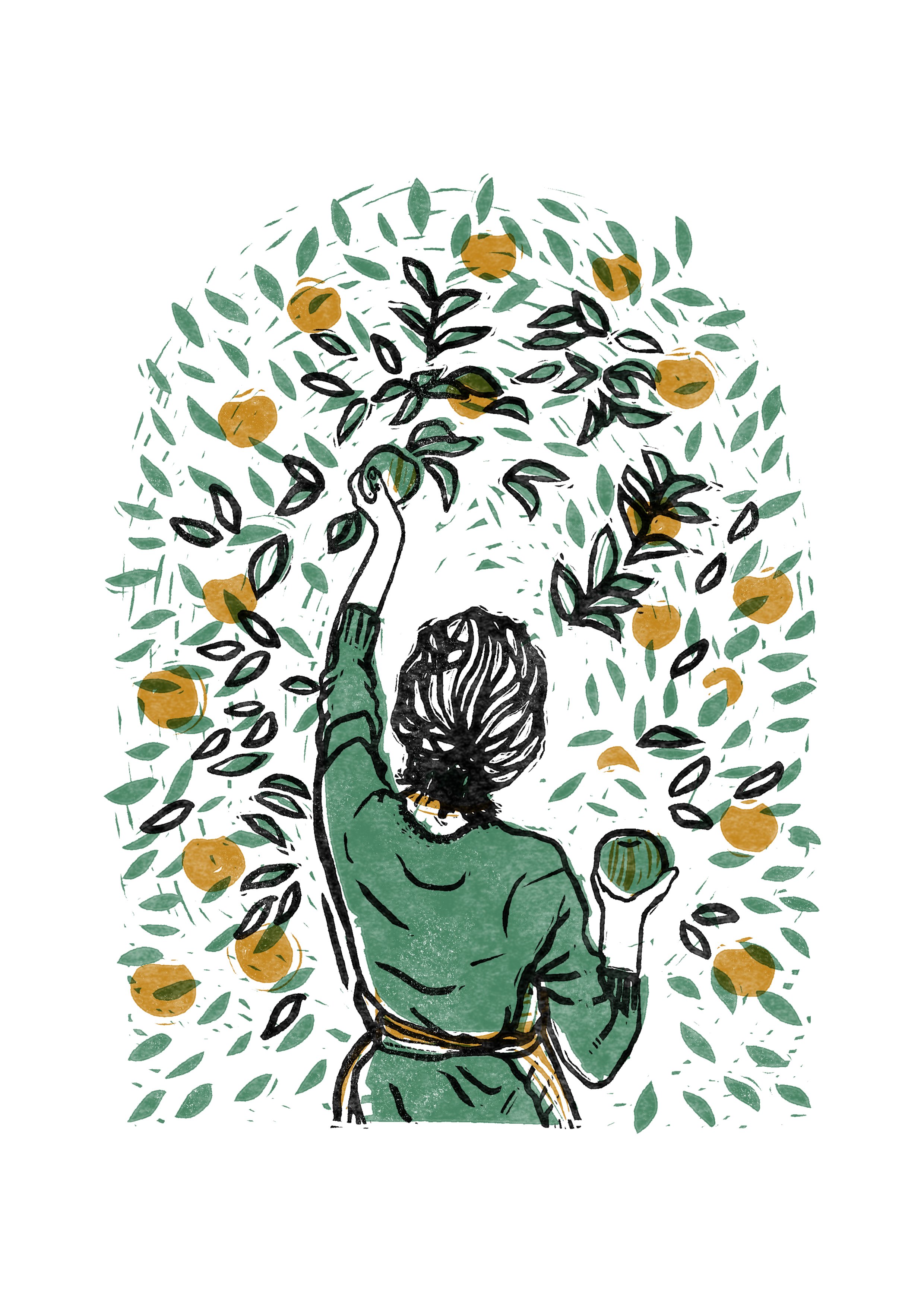
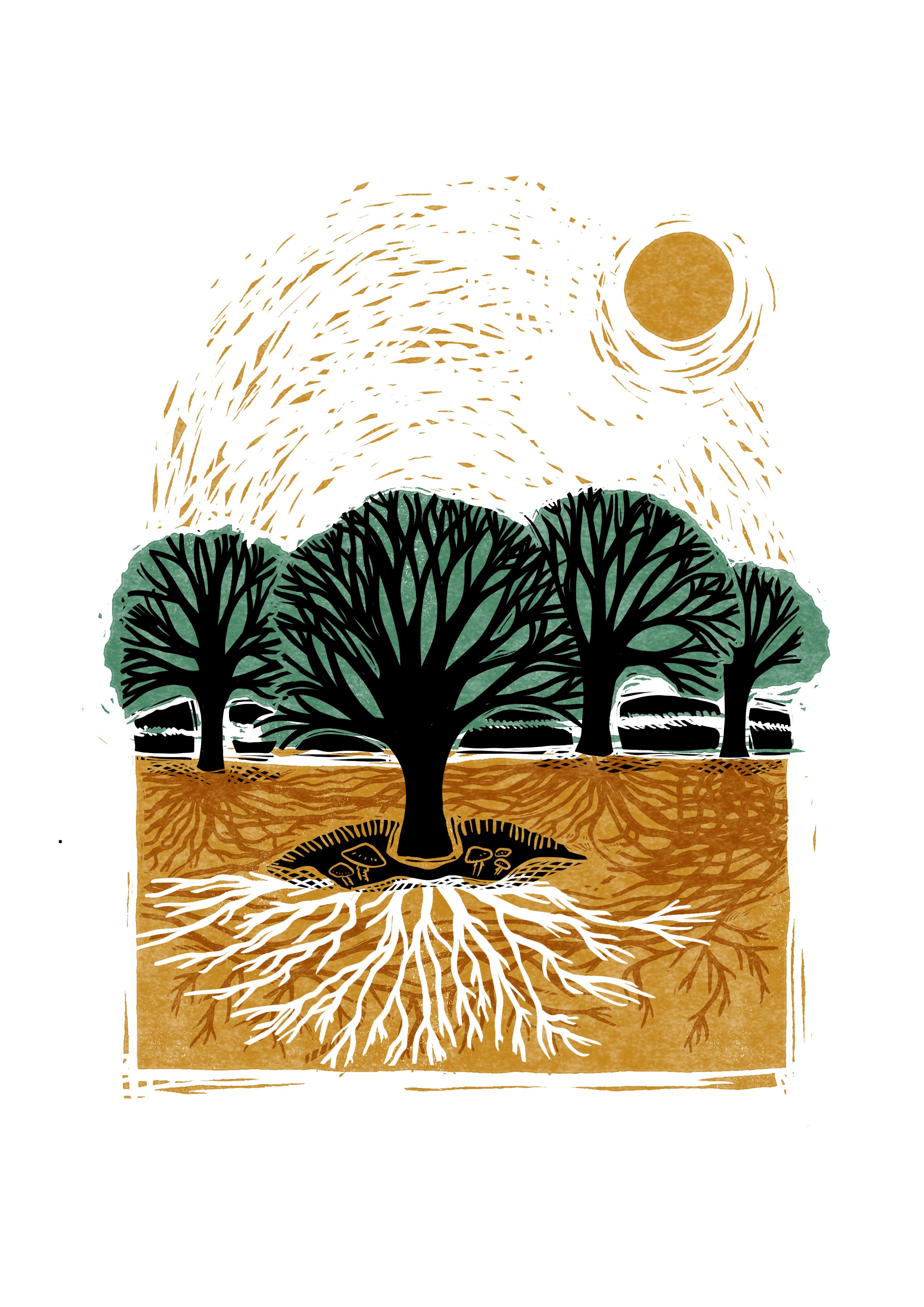
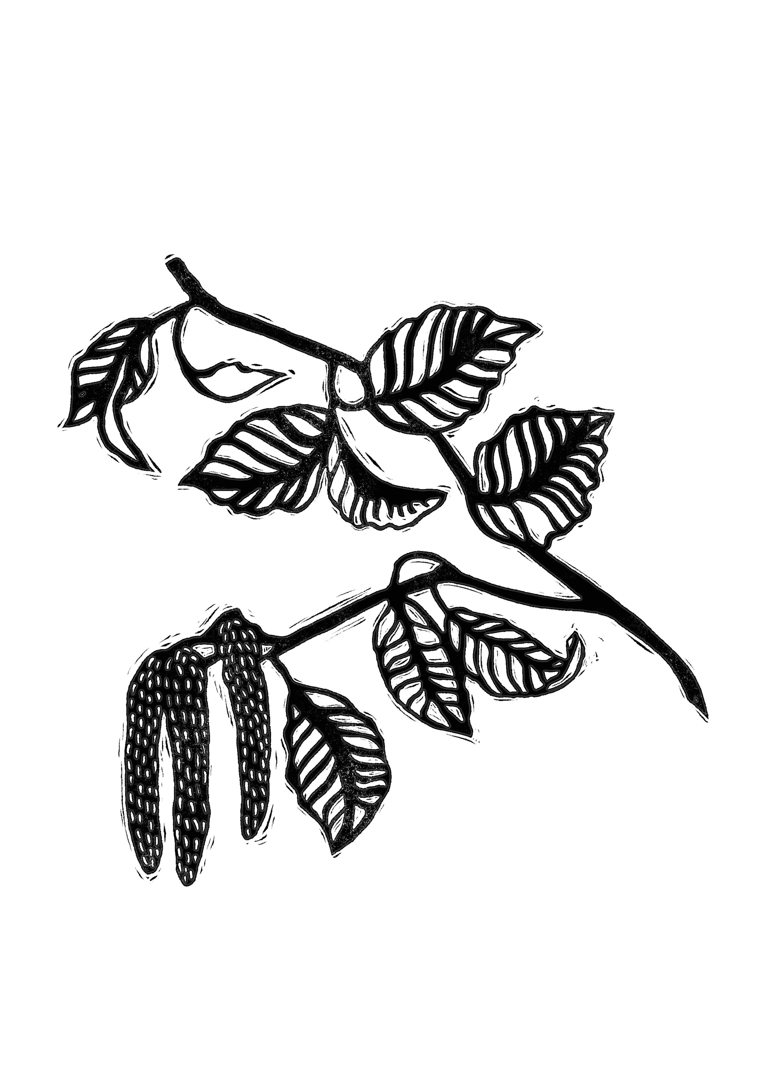
I’ve known and loved Rosanna Morris’s work for several years, and have her prints and postcards dotted around my study. There is such power and magic in sowing a seed and helping it thrive, and somehow Rosanna’s images capture that. They have a real feeling of abundance, with a kind of feminine grit!
I knew we needed Rosanna involved to realise this book’s potential, but I had no prior relationship with her, so I was anxious when I dropped her an email introducing myself and the project.
Thankfully, the idea really resonated with her too. She told me that tree planting is very close to her heart, and much to my relief she was immediately on board with the project.
“For me the book was an absolute joy to work on and particularly special to me as my late grandmother was so obsessed with trees. We planted a small forest together over a decade ago and it means the world to me that I get to carry on her legacy in some small way. The book is also such a beautiful object, it’s definitely one of my proudest achievements yet. ”
Rosanna developed the colour palette from my initial mock-ups, and when the final artwork came in, I reflected those colours back in the design. For the most part, I let the artwork lead the way and gave it plenty of white space, but the cover was an opportunity to bring Rosanna’s illustration into a bold, typographic design and really shout that call to arms. The final cover was a last-minute wild-card I threw into the mix, after numerous variations on a different cover concept. It was one of those beautiful, decisive moments when everyone got on board with the new direction and we went for it!
Geek-out box
Here is a little behind-the-scenes factoid for my fellow nerds! If you happened to have bought this book, and happened to have wondered why the species are listed alphabetically by their latin rather than their common names, I can shed some publishing light for you! Titles which will be printed in more than one language need to have their black plate changed several times, whereas the coloured plates will be the same for all the editions. So, in order to print the fruit illustrations in colour, their order had to be consistent across all editions (and common names vary from one language to another). Thankfully, latin names are international, and so by listing them this way we could print the illustrations in colour (yay!) and even print the latin names in colour (double yay!) - a rare treat, when you’ve been restricted to black for all other text.
