Creating Kantha
Kantha, by Ekta Kaul
I’ve been wanting to share this book design project for the longest time - and it’s finally published and out in the world!
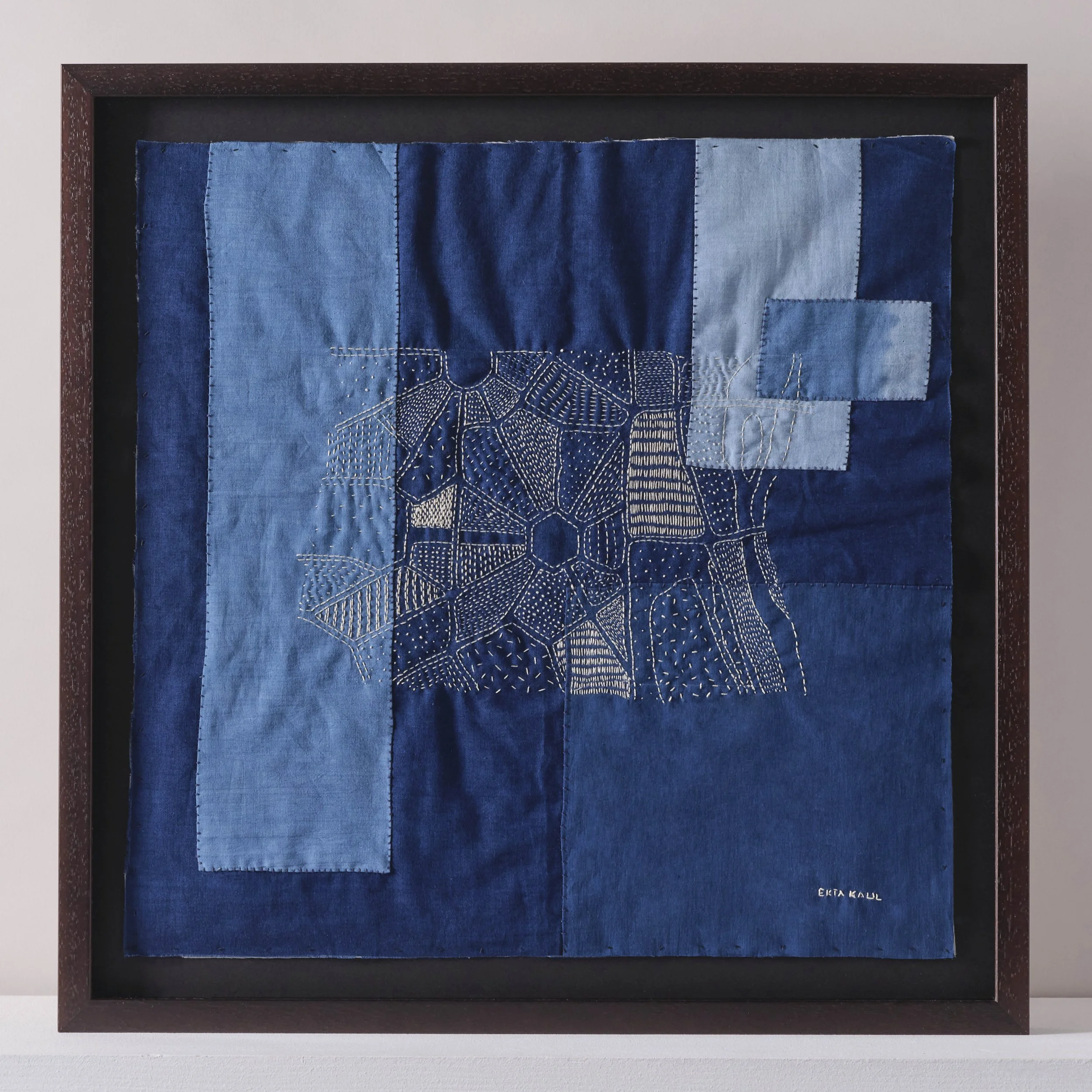
Originating from West Bengal, kantha is the practise of embroidering new life into tired fabrics, and is explored in this title by artist Ekta Kaul published by Bloomsbury imprint Herbert Press.
I was so inspired by kantha’s ethos of elevating, rather than discarding, worn textiles. It’s the ultimate antidote to ‘fast fashion’ - giving the fabric new life - creating something deeply personal and meaningful, as well as beautiful and useful.
The book dives deep into kantha’s cultural heritage, introduces us to artists (including Ekta herself) who use elements of kantha in their work, and teaches us how to create our own kantha, from concept, through stitch techniques, to a finished piece.
For the design, I distilled a palette of five colours from looking at a wide select of vintage kanthas. As with many books, all the text in this title needed to be on its own, black-only layer, which is frustrating when you’re dealing with a subject matter that’s all about colour and texture! I got around it by using tints of black overlaid on our more vibrant colours - creating a muted tone which reads clearly but still has depth and texture.
I chose Livory as the display typeface - for its soft, organic serifs and spacing/ligatures which reflect continuous stitch.


